4 Mistakes to Avoid When Designing Your iOS App UI
It's common for UI design to be one of the last things development teams think about when creating iOS apps. This includes situations when the developers need to relay what they need to the designer, often uncomfortably close to the launch date.
It’s also common, in scenarios like this, to have designers not specifically familiar with iOS, creating UIs that look great on other platforms, but end up looking messy and buggy when ported to iOS.
This is understandable. iOS UI design can be difficult. But, as understandable as it is, neglecting the app UI can sabotage even the best-built app if it means people experience friction using it.
How can you create a UI for your iOS app that delights your user without making it difficult to maintain? Like many things in software, a little bit of planning goes a long way in avoiding common mistakes. Here are four mistakes you see in iOS app UI design or when working with UI designers.
Mistake 1: Failing to Communicate
UI designers and app developers usually have very different skill sets and notice different things when looking at the same app. This distinction is often missed on a lot of projects.
On one hand, a designer may not understand all the code that has gone into the app. So, they won’t know what constraints they need to consider when designing the UI. On the other hand, a developer may not understand why a designer specified a particular layout.
The unfortunate reality is developers and designers can be confused by each other's work during a project. This means missed opportunities and deadlines, frustrated professionals, and time and cost overruns.
Avoiding this mistake is relatively simple: create time and space for both designer and developer to communicate directly in a way that works for them. It gives them room to develop a mutual understanding of both what the app can do and how that can be designed to create a great user experience.
Mistake 2: Not Respecting The Development Environment of iOS
One error people often make is not recognizing the specific constraints of building an app for iOS. Apple’s ecosystem is unique, requiring you to do things a certain way. There are limitations that are either different or don’t exist on other platforms. This affects everything – from button placement and usage, to what fonts you can use and in what sizes and weights.
This can be challenging if a designer isn’t specifically versed in iOS. There is an enormous appeal in having an app that you only have to build once and can be used everywhere. But it's difficult, and sometimes impossible, to take what you have on a website or Android app and make it look and work the same way in iOS.
Trying to shoehorn an Android UI design into iOS will often lead to shortcuts and hacks that work, but leaves you with an app that doesn’t look good and/or work reliably.
When it comes to both iOS development and design, if you don’t want headaches later on maintaining the app, you’re far better off building and designing your app natively. Apple also provides guidelines to their platforms to help guide both the design and development of the app. And with the widespread deployment of SwiftUI, Apple is encouraging us to make it easy for ourselves.
Mistake 3: Not Being Consistent With Design
Related to the above, an issue app designers run into is trying to design everything to be as customized as possible, but without consistency. Designing this way is nothing new. It’s very popular and successful in web design, with whole rafts of different pattern libraries and tools available.
But in iOS, this is more difficult to emulate, resulting in design elements that are a hassle to update. They might also be only possible with third-party plugins and libraries, creating a lot of dependencies for the app.
To avoid design inconsistency: having a single pattern library for an iOS project is a good idea, but only one. This means both elements aren’t going to have to be designed in every instance and ensures consistency in appearance throughout.
Mistake 4: Trying To Do Too Much With An App
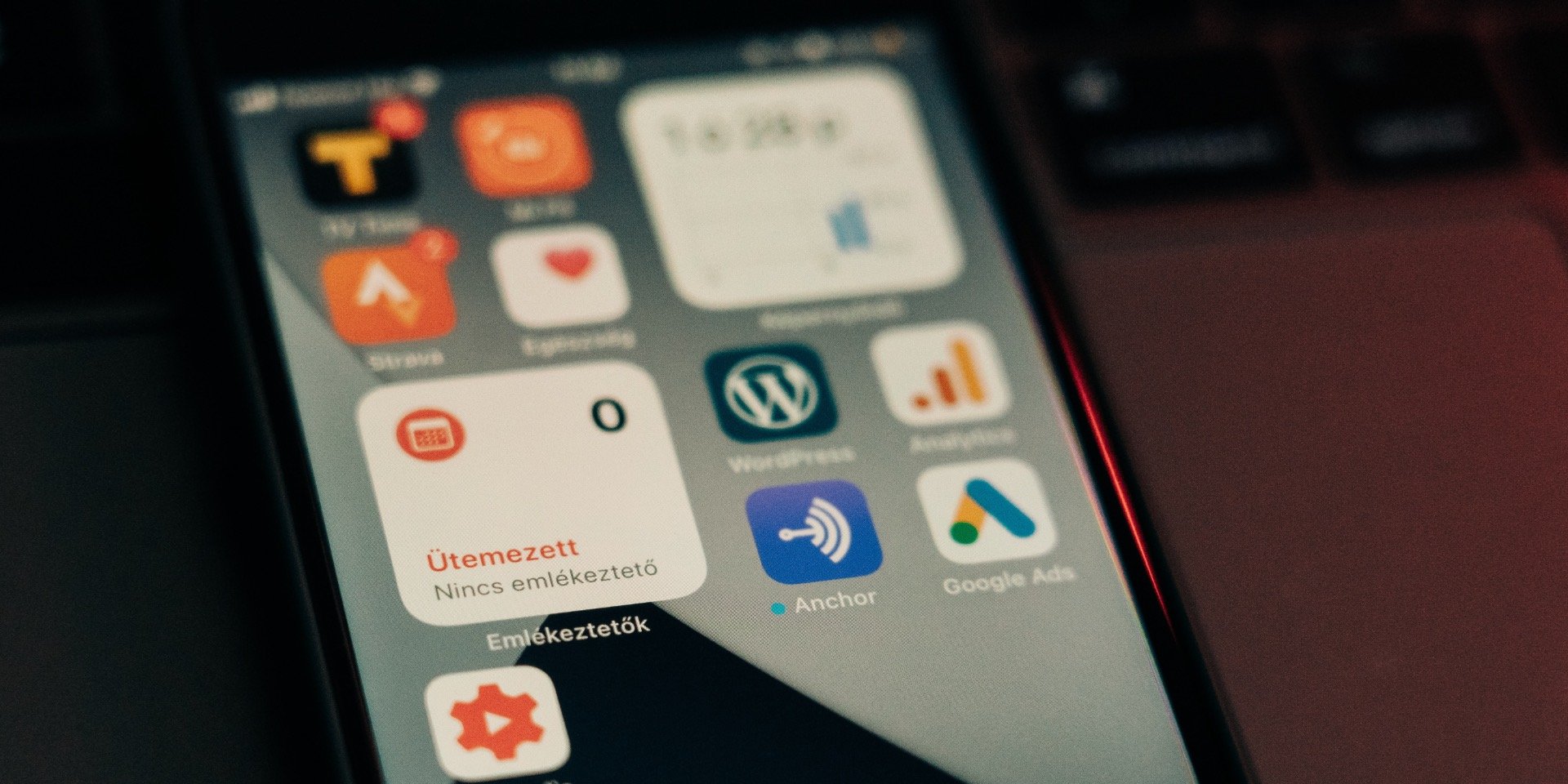
The other mistake you often find with design inconsistency is an app’s design trying to do too much. Nowhere this is more evident than with widgets in iOS 14, where a designer has tried to cram as much as possible within it.
Widgets should be all about focusing on communicating a single idea, message, or bit of information to your user. Widgets, by design, need to be glanceable – they exist so people can get information quickly.
For example let's say you have a weather app. It can show the users lots of different details about the local weather. A good widget for an app like this should ideally focus on only delivering one detail at a time – such as the current temperature. However, users may also want to frequently know what the current forecast is as well.
The mistake happens if you design a widget fitting both temperature and forecast together at the expense of no longer being glanceable. Sure, you've maximized available space, but your users will no longer find it easy to look at quickly.
Additionally, you also have to consider the different sizes of iPhones. A widget that’s comfortable to look at on the 6.7” screen of an iPhone 12 Pro might be difficult to read on the 5.4” iPhone 12 Mini. And with the tendency for tech professionals to go in for the biggest and best available, this can be easily missed by both developers and designers before going live.
For apps like this, a good rule is to always give things more space on the screen than you think they need. If you need to put that information somewhere, you’re best off:
- Offer the widget in larger sizes
- Creating two different widgets for each piece of information; or
- Have one widget, but make it easy for your user to change the information displayed.
Consider how much of that data is really necessary, and what your users ask for. Sometimes having less leads to a more positive user experience
So there you have it, four all-too-common mistakes to avoid when it comes to UI design, and how you can stop them dragging down your iOS app.
Good UI design creates a connection to your user gives them a pleasant, effortless experience using your app. This can mean the difference between an app that’s a positive investment for your business, drawing in and retaining customers, or a flop that you’ll write off when it becomes too much of a pain to maintain.
Want to avoid more mistakes in iOS development? The BrightDigit newsletter gives you regular helpful tips and advice right to your inbox!
A couple of times a month, I publish a newsletter, with news, updates, and other content related to Apple and iOS. I try to help people better understand how to succeed with iOS apps, and keep you informed about what’s coming up on the horizon for the industry.
If that’s something you want more of, click here to subscribe, and enjoy!